Designing Calm: How Nadara’s Page Moves With Purpose
We helped Nadara increase trust and engagement by designing a landing page that mirrors the product's rhythm: calm, clear, and human.
About Nadara
Nadara blends yoga, nutrition, and mindfulness into a daily wellness ritual that fits real life. Their brand is soft but confident –designed to feel calming, not clinical.
We helped them distill that vibe into a website that converts without pushing. The goal: increase signups and guide users gently into their content funnel.
A Few of Our Favorite Sections
We’re not showing every pixel – just the moments that mattered most. The parts where copy, layout, and interaction clicked to create momentum.
Hero That Breathes
The large, open layout mirrors Nadara’s core brand values – calm, balance, and clarity. The soft gradient, centered CTA, and expressive photo create instant trust without shouting.


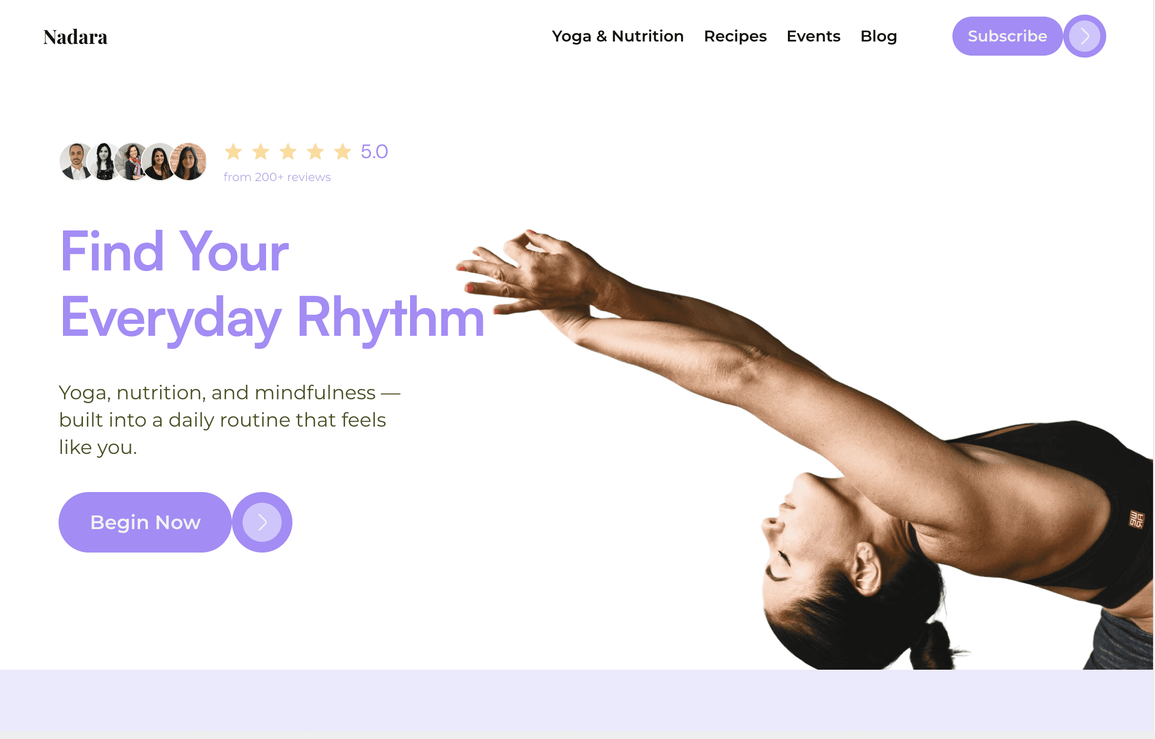
Curious why this section instantly pulls you in?
Offerings, Organized for Action
Three complex services reduced to simple cards with icons, spacing, and copy that speaks your language. Clear paths, no overwhelm. It’s education made intuitive.


A CTA That Doesn’t Shout
Rounded corners, soft curves, and a calm gradient: This is a conversion section that matches the tone of the brand. Feels more like a conversation than a sales pitch.

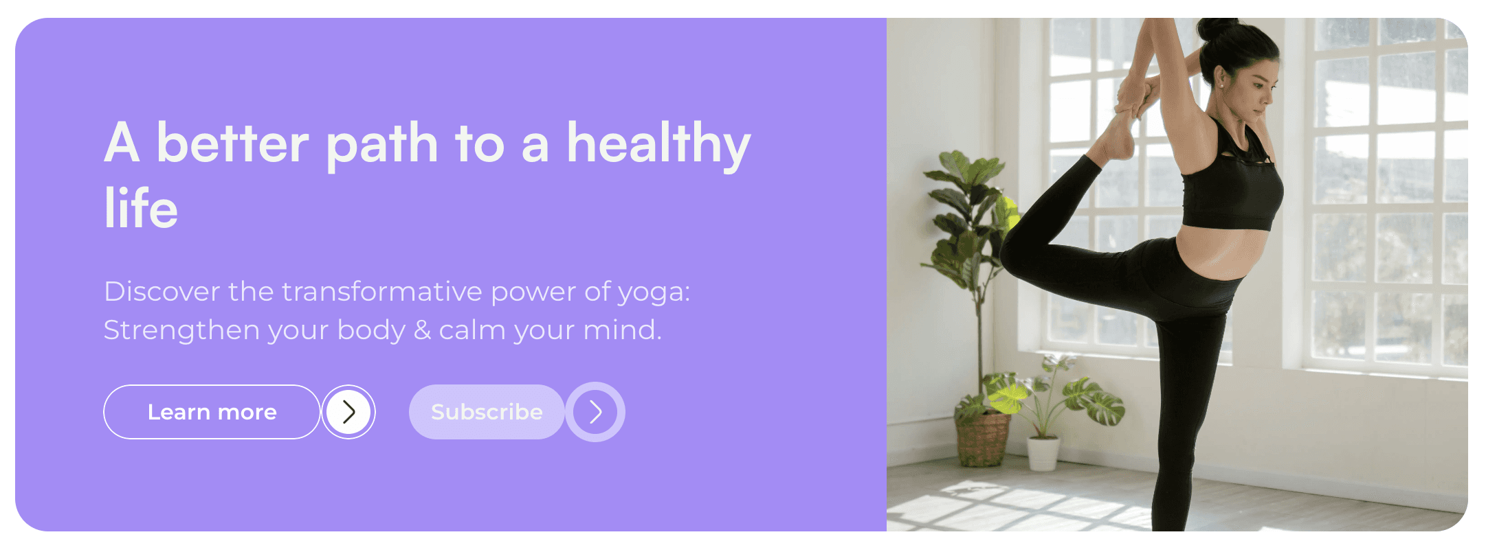
Want to know why this call-to-action performs?
Mobile, Without the Mess
This mobile section shows we don’t just shrink things down — we rethink them. Beautiful rhythm, easy taps, and visual storytelling that still breathes.

What Changed for Nadara
+72% More Signups
Clear structure and soft design boosted first-time visitor conversions.
Reduced Drop-Off by Half
Calmer page flow and mobile-first layout kept users engaged.
Launched in 3 Weeks
From wireframes to launch without a single design round wasted.
This example is based on a fictionalized project. Any names, brands, or results referenced are used illustratively to reflect the quality and style of our work.
© 2025 Synlig Studio. All rights reserved.