The Power of a Great Landing Page: Why Simplicity Wins
By Synlig Studio | April 2025
Most landing pages fall flat. They either overwhelm you with chaos – multiple headlines, dozens of buttons, walls of text – or swing to the other extreme and barely say anything at all. In both cases, visitors end up confused, bored, and gone. The result? No conversions, no leads.
So, what's the fix? Simplicity. But simplicity isn’t about empty space or trendy minimalism. It’s about clarity. Clarity of message, clarity of structure, and clarity of the path to action. When your page is clear on all three, it cuts through the noise and sparks interest every time.
Simplicity = Clarity on three fronts:
Clarity of message.
Your visitor instantly gets what you’re offering. No guessing, no jargon.
Clarity of structure.
Your page flows logically, one section to the next, like a good story.
Clarity of the path to action.
It’s always obvious what to do next (click this, sign up here), with no distractions derailing the journey.
At Synlig Studio, we’ve seen the power of clarity firsthand. When we built the landing page for VOLT – a SaaS dev tool with bold branding that cuts build times in half – we went all-in on a simple, strategic approach. The result was a clean, high-converting page that proves our point: simplicity wins. Let’s break down the tactics we used (and that you can use too) to make a landing page great.
Visual Hierarchy: Lead the Eye in the Right Order
The first job of your landing page is to grab attention and guide it. Visual hierarchy is all about leading the viewer’s eye to the most important thing first, the next most important second, and so on. If everything screams for attention, nothing is heard. If nothing stands out, everything is ignored. You need to design with intent: one main message, one primary action, and zero clutter.
On VOLT’s page, we made sure the very first thing you see is the core benefit. A bold headline, just 10 words long, dominates the hero section, immediately telling you what VOLT does for you: Cutting build time in half. Right beneath, front-and-center is a single, contrasting call-to-action button inviting you to get started. There’s no menu bar, no secondary offers, no fluff. Just a huge promise and a button – one thing to read, one thing to click. It’s obvious where your eyes should go and what your next step is.
In a noisy world, this kind of focused hierarchy is a breath of fresh air. At a glance, you know exactly what VOLT is offering and how to take action. The design literally points your eyes to the conversion goal.
In VOLT’s case, the hero section is ultra-focused: a giant benefit headline, a single CTA, and nothing else to distract.
Takeaway
Structure your hero section (and every section) so there’s one clear star of the show. Maybe it’s a headline and signup form, or a product image and tagline – whatever it is, make it pop. Use size, color, and placement to create a natural visual path. Your visitor’s eyes should never have to guess what to look at next. If they have to hunt for the point, you’ve already lost them.
Section Flow: One Question per Scroll
A great landing page feels like a guided tour. Every time a visitor scrolls, the page should answer one key question that’s on their mind, then subtly lead them to the next section. The formula is simple: one scroll, one takeaway. This keeps visitors engaged, because you’re satisfying their curiosity step by step instead of dumping a manual on them or, conversely, leaving them in the dark.
Think about the typical questions a visitor has as they land on your page. For example:
“What is this, and why should I care?”
“Okay, how does it actually work?"
“Who else is using it and can I trust this?”
“Alright, I’m interested – what do I do next?”
Each of these deserves a section on your page, in this exact order. Most cluttered pages fail because they try to answer everything at once or answer the wrong questions too early, while overly sparse pages might skip some of these questions entirely. Your goal is to cover each, quickly and clearly, as the visitor scrolls.
On VOLT’s landing page, we mapped out a logical Q&A flow just like that. The hero section answered the first question with a bold value proposition. Scroll down, and the next section gave a brief “how it works” overview, using a simple graphic and a few words to show VOLT in action. One more scroll, and you hit a comparison section tackling the “is it better?” question head-on – showing VOLT vs. the old way side by side.
For instance, we dropped the fluff and built a visual comparison that highlights how Volt stacks up against the typical manual build process. In seconds, the difference is obvious: faster output, zero setup, and no tech headaches. It’s proof of value – clean, sharp, and undeniable.

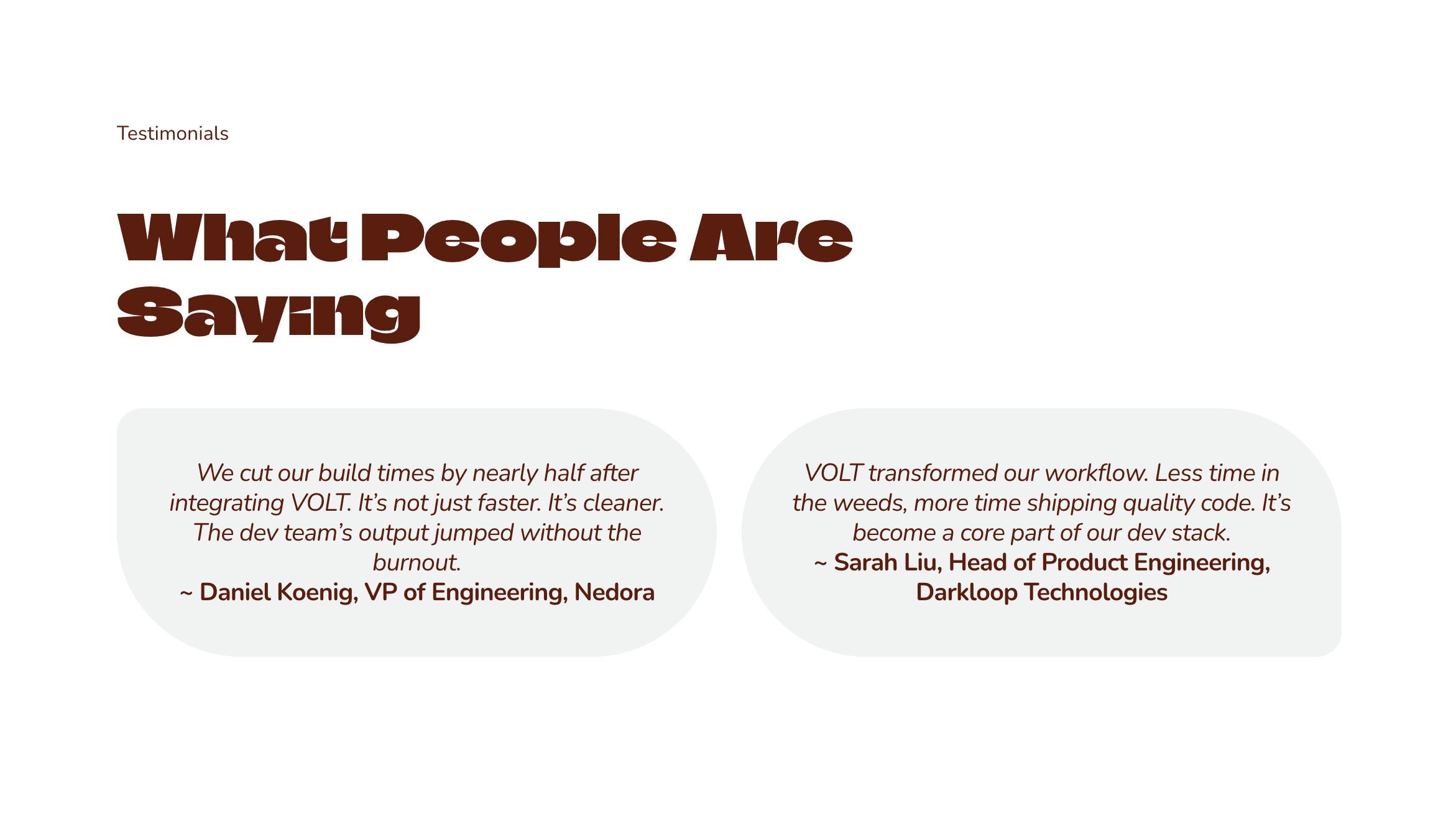
Next, we built trust with social proof. We added a section with testimonials talking about how VOLT slashed their build times. Real voices, short and sweet, reassure new visitors that this tool actually works in the real world.
By the time someone scrolls through those sections, we’ve answered what it is, how it helps, why it’s better, and who else loves it. What’s left? The final call to action – an invitation to get started. At the bottom of VOLT’s page, we capped things off with a simple sign-up prompt and that same bold CTA button from the hero repeated. No new questions pop up, no doubts linger; every section did its job.
Takeaway
Design your page like a narrative. Each section should address one main idea or question and only that idea. Don’t mix “how it works” content into your hero, and don’t introduce new features in your testimonial section. Keep it linear. When a visitor scrolls, they should feel a sense of progress (“Oh, now I see what this does… Now I see why it’s better… Now I see who uses it… I’m convinced, let’s go!”). That momentum is gold for conversions.
Copy Brevity: Why Fewer, Sharper Words Drive Action
Visitors don’t read landing pages – they scan them. If your page is drowning in paragraphs and technical jargon, you’ve already lost most people. The key is to say just enough to get the point across and make the user want more, then stop. Fewer words. Simpler words. Sharper impact.
Think of it this way: you have maybe five seconds to hook someone’s attention. They’re not going to wade through a 300-word essay in your hero section to figure out what you do. So we fight for brevity. Every sentence, every phrase needs to earn its spot. If it doesn’t drive the story or push the visitor closer to action, cut it.
On VOLT’s page, we distilled our messaging to the essentials. The main headline was a blunt one-liner – no clever puns, no fluff, just the value. In three seconds, any visitor knows what VOLT promises. And that’s it for the intro. We didn’t waste words welcoming people to the site or talking about how “innovative” the product is – we jumped straight to what matters to the user: what it does for them.
This philosophy continued down the page. Each section had a concise heading and a brief description or a few bullet points, not a dissertation. For example, instead of a long paragraph explaining features, we used an ultra-trim list of key benefits in plain language:
Instant Output
From idea to deploy in minutes. No bottlenecks, no back-and-forth.
Zero
Setup
Fully hosted. No local installs, no tech headaches. It just works.
Flawless by Default
Clean, precise builds every time. No bugs. No bloat. Just results.
Notice how each bullet packs a punch in just a few words. A visitor can grasp what the feature is and why it’s good almost instantly. We skip the deep technical details on the landing page – those can come later, after the sign-up, in docs or onboarding. The landing page’s job is to intrigue and persuade, not to answer every possible question. Brevity makes sure we hit the highlights and nothing more.
Another place brevity shines is your call-to-action copy. On VOLT’s CTA button, we went with “SEE IT IN ACTION”. Short, inviting, and clear. Many pages dilute their CTAs with multiple options or wordy phrases like “Learn More about Our Solutions”. Not here. One button, a few words. That singular focus greatly increases the chance that a visitor actually clicks.
Takeaway
Cut the fluff, then cut some more. Every word should pull its weight. Use short, punchy headlines and subheads. Use bullets or icons to convey benefits at a glance. Don’t be afraid to be blunt – clarity beats cleverness when it comes to conversion copy. And remember the 5-second rule: if a newcomer can’t understand your offer in a quick glance, you need to simplify your copy further.
Scroll Pacing: Keep the Momentum Going (No Overwhelm, No Boredom)
Simplicity in a landing page isn’t just about what you say; it’s about how you deliver it over time. Scroll pacing is the art of keeping someone engaged as they move down your page. You want to maintain a sense of momentum – a feeling of “this is going somewhere interesting” – without ever overwhelming them or, on the flip side, putting them to sleep.
How do you pace a page effectively? It starts with the length and content of each section. We aim for each scroll depth to offer something new and worthwhile. If one section drags on too long, visitors might give up before reaching the good stuff below. Conversely, if your sections are too empty or repetitive, people might think they’ve seen it all and stop scrolling. It’s a balance: deliver value, then hint at more to come.
On VOLT’s landing page, we kept a tight rhythm. The hero was a quick hit of value (short and bold). The next section immediately changed it up with a bit of visuals and a short explainer, giving a visual break after the text-heavy hero. The comparison section introduced a table format – a different kind of visual – to keep things fresh. Then the testimonial band brought in faces and short quotes, which is another change of pace. This intentional variety made sure each scroll felt like a new chapter rather than a continuation of the same slog.
We also avoided the dreaded “false bottom” – that mistake where a page has so much blank space or a full-bleed graphic that the user thinks the page is over when it isn’t. Every section on VOLT’s page had a cue that more content awaited below: a slight peek of the next section, a downward arrow, or simply a design element that cuts off at the bottom to imply there’s more if you keep going. The message to the visitor: keep scrolling, you won’t regret it.
Crucially, we never hit visitors with a giant info-dump. Even though VOLT’s page was rich in content, it was sliced into bite-sized, scrollable pieces. Long-form landing pages can work brilliantly if they tell a compelling story and are easy to navigate by scrolling. It’s like a good screenplay – scene after scene, each compelling you to stay for the next.
And let’s not forget page speed and smoothness: part of pacing is ensuring your page loads fast and scrolls smoothly. Nothing breaks momentum like a choppy scroll or a loading spinner mid-page. Simplicity in tech (lightweight pages) aids simplicity in experience.
Takeaway
Guide your visitor down the page with a steady hand. Break your content into logical, airy sections that each feel approachable. Vary the presentation (text, then image, then testimonial, etc.) to re-capture attention at each scroll. Always indicate that there’s more to see – no dead-ends or confusing gaps. If you keep rewarding the scroll with interesting info (and not overloading them all at once), users will stick with you to the end. And that’s exactly where you can hit them with your final, well-earned call to action.
The Bottom Line: Simplicity Converts
Clutter is costly. Confusion is a conversion killer. The power of a great landing page lies in stripping away the noise and focusing on what actually matters to your customer. As we saw with VOLT’s example, a simple, clarity-first approach leads the user on a frictionless journey from first glance to final click. No detours, no fluff – just a straight line to the goal.
Founders, marketers, anyone with a product to promote: if your landing page isn’t getting the job done, it’s time to rethink and simplify. The good news? You don’t have to do it alone. Synlig Studio builds conversion-focused, purpose-built websites that just work. We live and breathe this stuff – structuring pages for maximum impact is what we do all day. If you’re considering a landing page revamp or a full relaunch, let’s make it something bold, clear, and insanely effective. Your website should sell, not sit there. Ready to cut the clutter and boost your conversions?
The examples are based on fictionalized projects. Any names, brands, or results referenced are used illustratively to reflect the quality and style of our work.
© 2025 Synlig Studio. All rights reserved.