Why Call-to-Action Placement Can Make or Break Your Website
By Synlig Studio | April 2025
Most CTAs are either buried or awkward. You’ve seen it: the primary button is hidden way down where no one looks, or it’s shoved in your face before you’re even interested. In both cases, you lose the user. The truth is, CTA placement isn’t about guessing – it’s about timing. The best calls-to-action appear at the moment a visitor is ready to click. In other words, good CTA design works with user psychology, not against it. At Synlig Studio, we’ve made CTA timing an art and a science – no fluff, just strategic placement that drives action.
So how do we do it? We place CTAs where they align with the user’s journey through a page. Typically, that means three key spots:
1.
At the start.
For early birds who already know what they want.
2.
In the middle.
For those warming up and starting to get interested.
3.
At the end.
For the fully convinced who just need a final nudge.
Above-the-Fold CTA: Immediate Clarity and Conversion
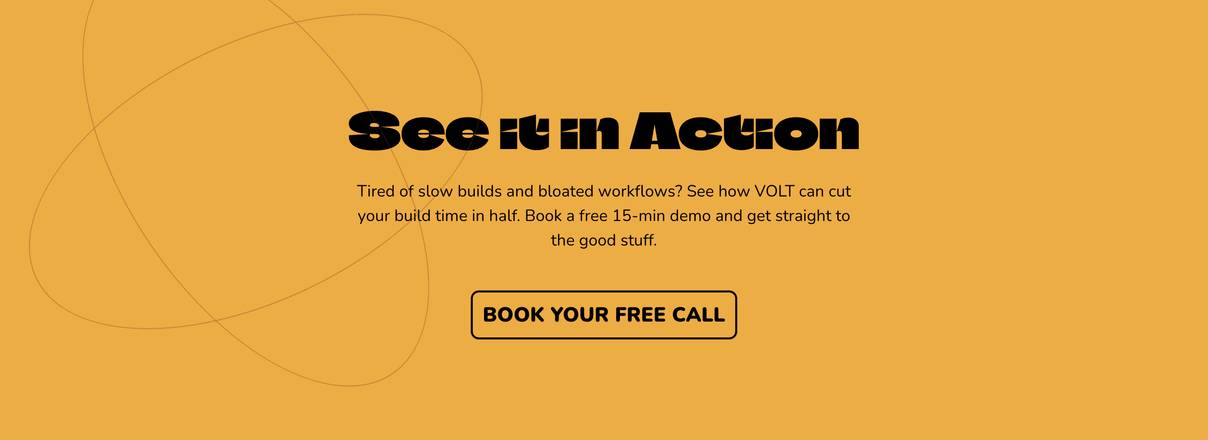
Volt’s landing page hero puts a bold value prop front and center, with a clear CTA button “See It In Action” immediately visible. This above-the-fold CTA grabs you the second you land on the page – no scrolling needed. Why does that matter? Because if your CTA is right there in the hero, it’s guaranteed to be seen by everyone who visits. Volt’s headline, “The dev tool that cuts build time in half,” delivers instant clarity on value, and the See It In Action button sits just below, impossible to miss against the dark background.
Notice how there’s nothing else cluttering this area – one message, one button. That simplicity cuts out noise (keeping cognitive load low so the user’s attention is laser-focused on the action). There’s a reason we didn’t dump five different buttons up there; too many choices just overwhelm people. Volt gives you one obvious next step, and it works.
Crucially, the micro-copy on Volt’s CTA is doing heavy lifting. “See It In Action” isn’t your typical “Buy Now” or “Sign Up” ask – it’s an inviting, low-commitment nudge. It piques your curiosity without asking for anything too serious. Essentially, it says “take a peek” instead of “give us your money.” This tiny phrase lowers the barrier to click: you’re thinking, “Sure, I’ll see what it can do,” rather than feeling forced into a commitment. By timing this CTA right at the moment of initial interest – and phrasing it as a casual invitation – Volt’s above-the-fold section converts curious visitors into engaged prospects in seconds.
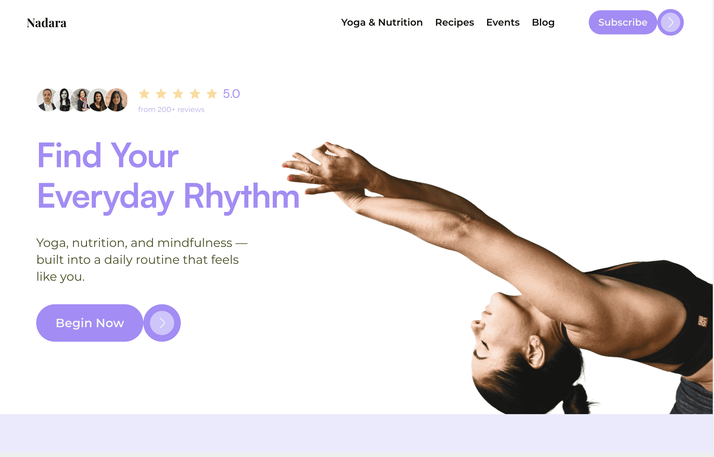
Nadara’s homepage takes a calmer approach, yet still features a prominent CTA “Begin Now” that aligns with the site’s tranquil vibe. This is a yoga, nutrition, and mindfulness site, so the tone is more gentle – but the strategy is the same: an immediate CTA, visible without scrolling, that feels like a natural extension of the headline. The header copy “Find Your Everyday Rhythm” speaks to the visitor’s aspiration, and right beneath it sits a soft-purple Begin Now button. It doesn’t scream at you; it invites. For a visitor exploring a wellness brand, “Begin Now” feels encouraging, not pushy. It’s essentially saying “start your journey when you’re ready” – a perfect match to the mindset of someone who came looking for a daily rhythm in yoga, nutrition, etc.
By placing this CTA in the hero, Nadara makes sure you see it immediately, but by styling and wording it to match the user’s mental stage, it avoids the awkwardness. Imagine if it said “Buy Membership” instead – that would be jarring. Instead, Begin Now nudges the user to take the first step (maybe start a free module or sign up for a newsletter) without any friction. The lesson: even an above-the-fold CTA should feel like it belongs; the placement gets it seen, but the copy makes it clicked.


Mid-Scroll CTA: Catch Users Once They’re Hooked
Not everyone clicks the first CTA they see – and that’s okay. Many users need a bit more convincing. That’s why we often include a mid-scroll CTA partway down the page, usually after the visitor has absorbed some value (like a section of features, benefits, or an engaging story). By the time someone scrolls mid-way, they’ve shown interest. This is the perfect moment to say, “Hey, ready to take action now?” Often we’ll present a CTA here as a break in content – for example, after a product overview, you might see a “Get Started for Free” banner or a signup form. It catches those who didn’t act immediately but are warming up to the idea.
Think of this as the second date in the conversion journey. The mid-scroll CTA is more than a reminder – it’s a well-timed prompt that appears right when the user has learned enough to want something. Importantly, we design these CTAs to flow with the content. Maybe you just read how our software saved someone 10 hours a week, and as you nod along, a CTA appears: “Try it Yourself”. It feels natural, because it’s placed at a moment when your interest is peaked. In UX terms, we’re aligning with the user’s commitment progression – by now, they’re more committed than when they first landed, so we can ask for a bit more. (Maybe the mid-page CTA is “Start Your Free Trial” instead of the top-of-page “Watch Demo”.) The key is timing and context.
From a usability standpoint, mid-scroll CTAs also ensure the user doesn’t have to go looking for the next step. If they’ve gotten halfway through your page, they shouldn’t have to scroll back up to find a button, or wonder what to do next. Every major scroll depth should have an obvious action available. We’re basically saying, “If you’re ready now, here you go.” In fact, studies back this up: when a page provides the right info first, a CTA placed below the initial fold can outperform an early CTA. One experiment showed that a below-the-fold CTA (one that appears after some persuasive content) led to a 20% higher conversion rate. The reason is simple – by that point, the user had all the context and felt confident clicking. So, a mid-scroll CTA is our chance to convert the folks who needed that extra story or proof before taking action. It’s all about timing the ask with the user’s readiness.
Bottom-of-Page CTA: The Clean Final Ask
Some visitors will read everything on your page – every last detail, all the FAQs, the works. When they reach the bottom, they’ve gotten full context. This is your moment to hit them with a clean, straightforward call-to-action. A bottom-of-page CTA is often the final nudge that says, “Alright, you’ve made it this far – ready to do this?” By now, if someone has scrolled to the footer area, chances are they’re seriously interested. It would be a crime not to offer an easy way to convert at that point!
We usually make the bottom CTA a no-nonsense, high-contrast section on its own with a big button to match. It’s a clean ask with zero distractions – often the rest of the page has ended, so that CTA stands alone as the logical next step. This is where we often repeat the primary CTA of the page in case the user didn’t click earlier. The bottom CTA gives the visitor a final opportunity to act without having to scroll back up or hunt through the page. It’s “last call” in a friendly way.
One thing we ensure here is consistency and clarity. If our top CTA said “See It In Action,” our bottom one might be the same or a direct follow-up like “Book Your Free Call” – but we won’t introduce a totally new call like “Subscribe to Newsletter” out of the blue. We keep the conversion goal unified. By the bottom, the user should know exactly what will happen when they click that button (no surprises). And since there’s nothing else competing for their attention down there, the CTA shines. It’s the ultimate clean finish: either they click, or they don’t – but if they don’t, it won’t be because we hid the ball or muddied the waters. We’ve given them every piece of info and a clear door to walk through.
CTA Placement Principles: The Psychology in Play
Let’s peel back the curtain – here are the core UX concepts that drive our CTA placement strategy:
Cognitive Load:
People can only process so much at once. If you surround your CTA with clutter or multiple competing actions, you’re making the user think too hard. A confused mind doesn’t click. By keeping pages focused (often one primary action per screen), we reduce mental overhead. Fewer choices = faster decisions. And this isn’t just gut feeling. Hick’s Law in psychology quantifies it: the more options you present, the longer people take to decide. The bottom line: Less clutter around your CTA means more focus on your CTA. We design every section to funnel attention toward one action so it’s crystal clear what to do next.
Commitment Progression:
A CTA is essentially asking for a commitment from your user, so you have to earn the right to ask for a bigger commitment by starting with smaller ones. We map our CTA wording and placement to the user’s mental stage in their journey. Early on, we use soft asks (“Learn More,” “See It In Action”) when the visitor is just getting to know us. As they scroll and get more invested, our asks get bolder (“Get Started,” “Create Account”) because at that point the user knows what’s in it for them. It’s like dating – you don’t propose on the first handshake. By the end of the page, if we’ve done our job, the user is warmed up and that final CTA (the “proposal”) doesn’t feel out of place. In short, we match the CTA to the visitor’s trust level at each stage.
Eye-Path Scanning:
Users don’t read every word; they scan. Good design places CTAs where the eye is likely to travel next, following natural reading patterns (like a Z-pattern across a hero section or an F-pattern down a text-heavy page). We pay attention to visual hierarchy and flow. For example, after a block of text or a feature list, a user’s eyes typically pause – that’s where we’ll put a nice big button. We want the CTA to feel like the obvious next element in the sequence, not something you have to go searching for. By aligning CTAs with how people naturally scan content, we make the experience seamless. In practical terms, that means prominent buttons at logical breakpoints, and using design cues to guide the eye right to the action. When the “click here” is exactly where your gaze goes, it’s almost reflexive to hit it.
Now, all of this strategic placement won’t mean anything if your offer or copy is weak – but assuming you have something people want, placing your CTAs thoughtfully can dramatically boost engagement and conversion. It’s not magic; it’s just about meeting the user where they are in their decision process.
Ready for CTAs That Pull Their Own Weight?
The examples are based on fictionalized projects. Any names, brands, or results referenced are used illustratively to reflect the quality and style of our work.
© 2025 Synlig Studio. All rights reserved.